There are endless ways to create a website. With that in mind, there are also endless ways to screw things up. There are two main ways to avoid falling into the second category – learn the basics of Web design and apply them appropriately. You also need to have enough experience to understand what works well and what doesn’t.
If you are reading this, hopefully, you are also trying to improve your work and create better designs.
Unfortunately, it is impossible to fit all the necessary knowledge into 1500 words. Instead, we’ll just give you some tips that will force you to rethink how you can approach UX / UI elements. Ideally, this mindset can be applied to other areas of your Web design work as well.
Start with a good understanding of the product/site
It’s very difficult to Web design if you don’t fully understand the content/website. So, you don’t need to study medicine to create a medical website, that’s not the goal. However, you need to know how the user will have access to any information that may be required.
If you want to develop an application for making music, you should first take a few of the existing ones, play with them to get a feel for them and read about the theory behind them, and how certain elements work.
Ideally, you should work with your client, who should also be very interested in the project and help you implement the best UX for your users.
However, if you lack a fundamental understanding of what the site is about and what problems it solves, you can damage the user experience or force yourself to follow existing solutions and just change their skin (which sometimes works).
For websites, you need to have a sitemap in front of you in order to work on proper navigation and make decisions about which elements are best for certain landing pages. If you are designing a “chocolate factory”, you can visualize the process of its creation or make an information dump.
All this information is what you need in advance to do better. Given how difficult it is, it can happen to you if you are an aspiring freelance designer, so it’s best to ask a lot of questions from the beginning. If you work in a team, remember to consult with your team members about content, UX, purpose, and more.
Design Tips & Tricks:
Now let’s take a look at some specific UI / UX tips that you can use in your next design:
1 – Contrast!
It’s so easy to spoil the contrast on a website. A quick way to find a less experienced designer is to check the overall contrast. See this example: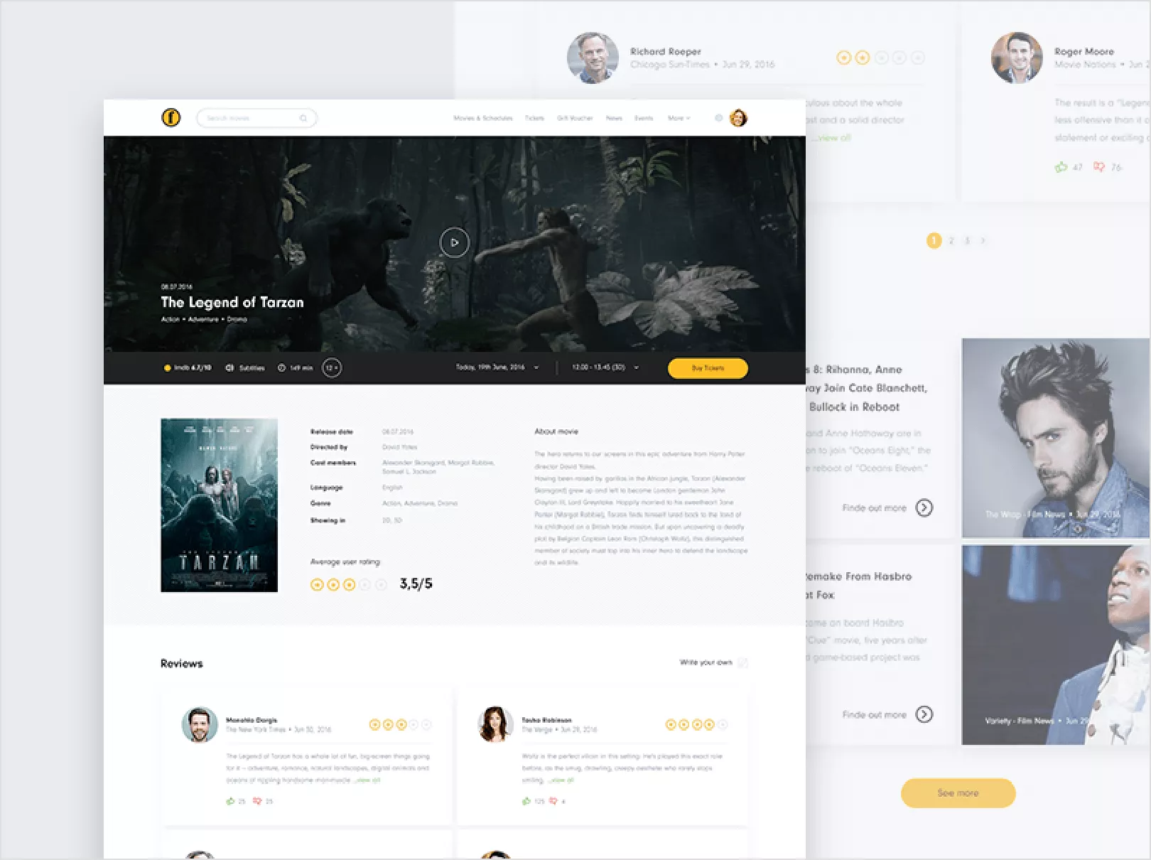
See how light the text is everywhere? Green buttons with white text, light gray text? Let’s compare it with a more contrasting interface: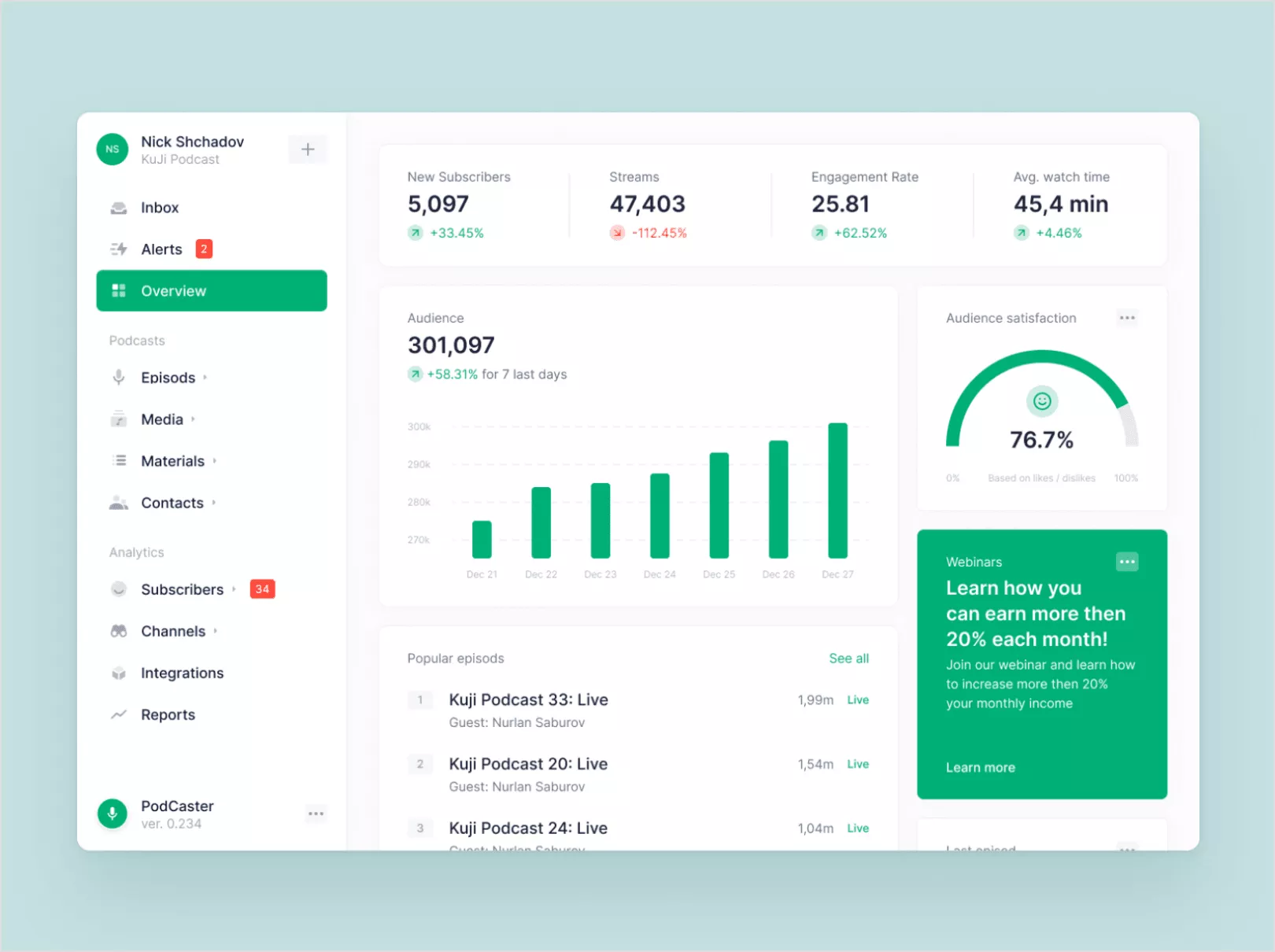
Most of the font is black (or nearly black), and less important information is slightly grayer. Green is darker, allowing white text to appear on top.
The tip here is when you’re working with text, start with black on white or white on black. As you add more elements and need to separate using visual hierarchy, try bold or change the font size first. Only after that, if that doesn’t work, change the color, but ideally no more than a 30-40% difference (usually the opacity is set to 70%).
Website Designing in Lahore is the most famous company, you can contact him.
2 – Permanent white space
Another common mistake is mismatched element spacing. In fact, it’s so common that most designers continue to struggle with it after years of work, which is understandable – we move boxes with the mouse. It’s easy to slip a little and move a pixel or two to the side. Or you may not have trained your eye well enough to notice the difference right away.
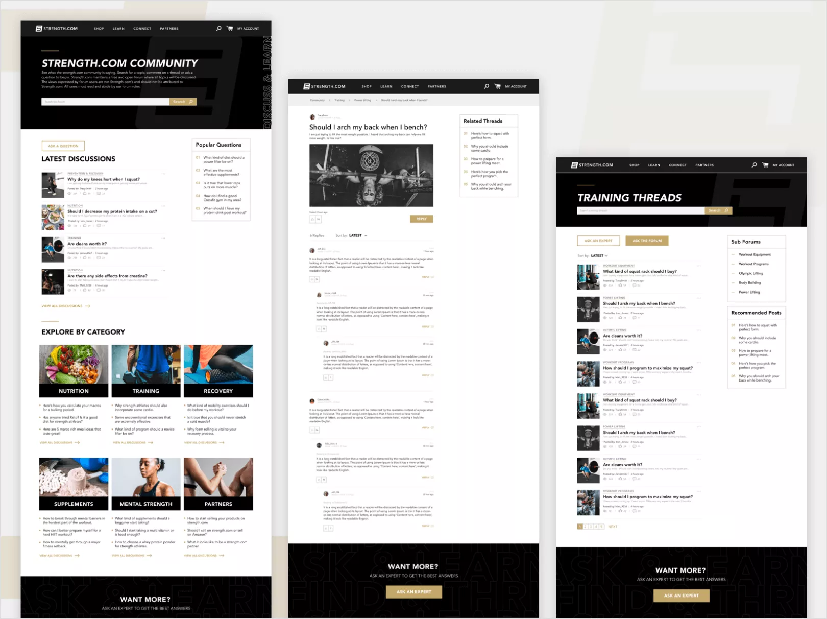
In the following example, see how different components have different white spaces around them. Some are clustered together, some are heavily spaced. Visually, it doesn’t look very coherent.
In contrast, here’s an example with more or less the same amount of content/component types, but with a more consistent look and feel: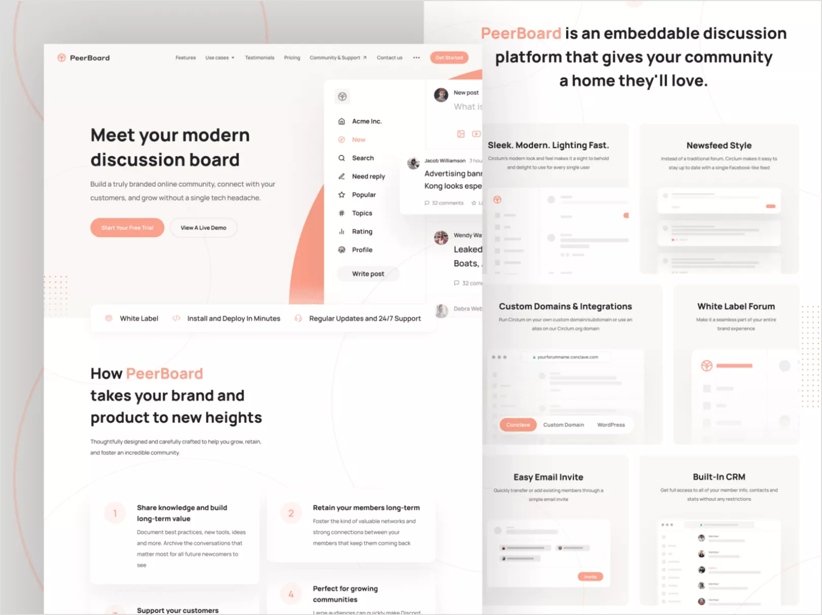
There are different ways to accomplish this, but most of the time it doesn’t work with a simple measurement. When you look at it, there is often a feeling. Does it look balanced? Once you have blocks, you can always measure something like 30 pixels on the sides, 30 pixels under the title, 15 pixels under the subtitles, etc. And that’s a good approach! But with larger visuals like headers or images, you can enlarge them a little to compensate for the heavier element.
3 – Color
Another fundamental ingredient of good Web design. The colors should match well. One easy way to approach websites is to stick to one primary color and leave the rest monochrome.
The following example follows all three guidelines – Good contrast, balance, and use of color: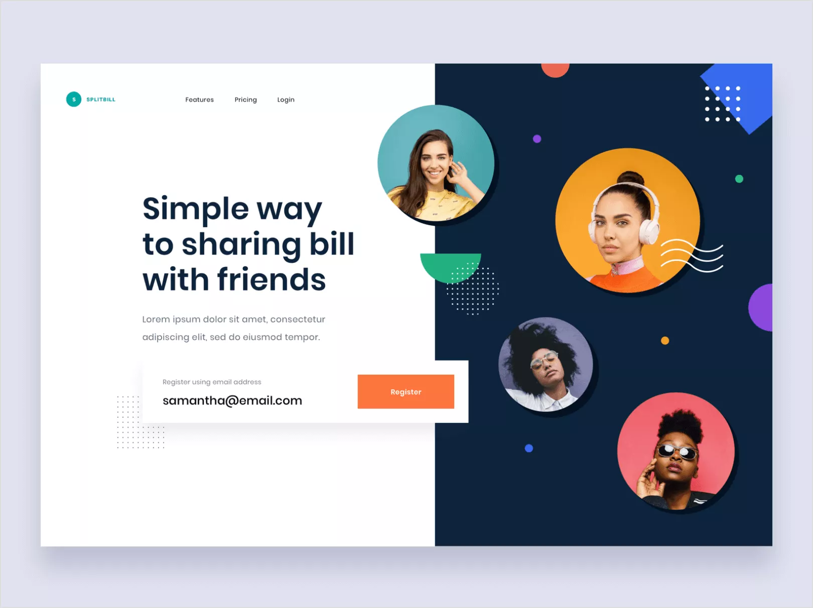
One easy way to start with colors is to follow some well-accepted color schemes from sites like https://colorhunt.co/ or take inspiration from Dribble for combinations of them. Working with the color wheel is useful for identifying combinations, but it often takes a little extra work for designers to find the best combinations. Color wheels often do not produce ideal colors for Web design applications.
Example from Adobe’s color wheel: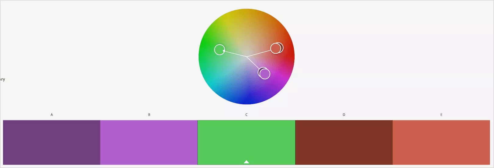
Nice green in the middle, but tricky to use left/right results.
4 – Stick to style throughout the site
Creating the feel of a website is one of the main tasks of a designer. Although the concept of “beautiful” is very difficult to define, especially since people often have different attitudes towards what is good and what is not. … Instead of worrying about it, focus on consistency and style.
What does it mean? Well, let’s start designing the button. We set the font size, font, color, background, spacing, etc. And we get something like this:

Now if we add an image and a title, we can achieve something like this, perhaps:
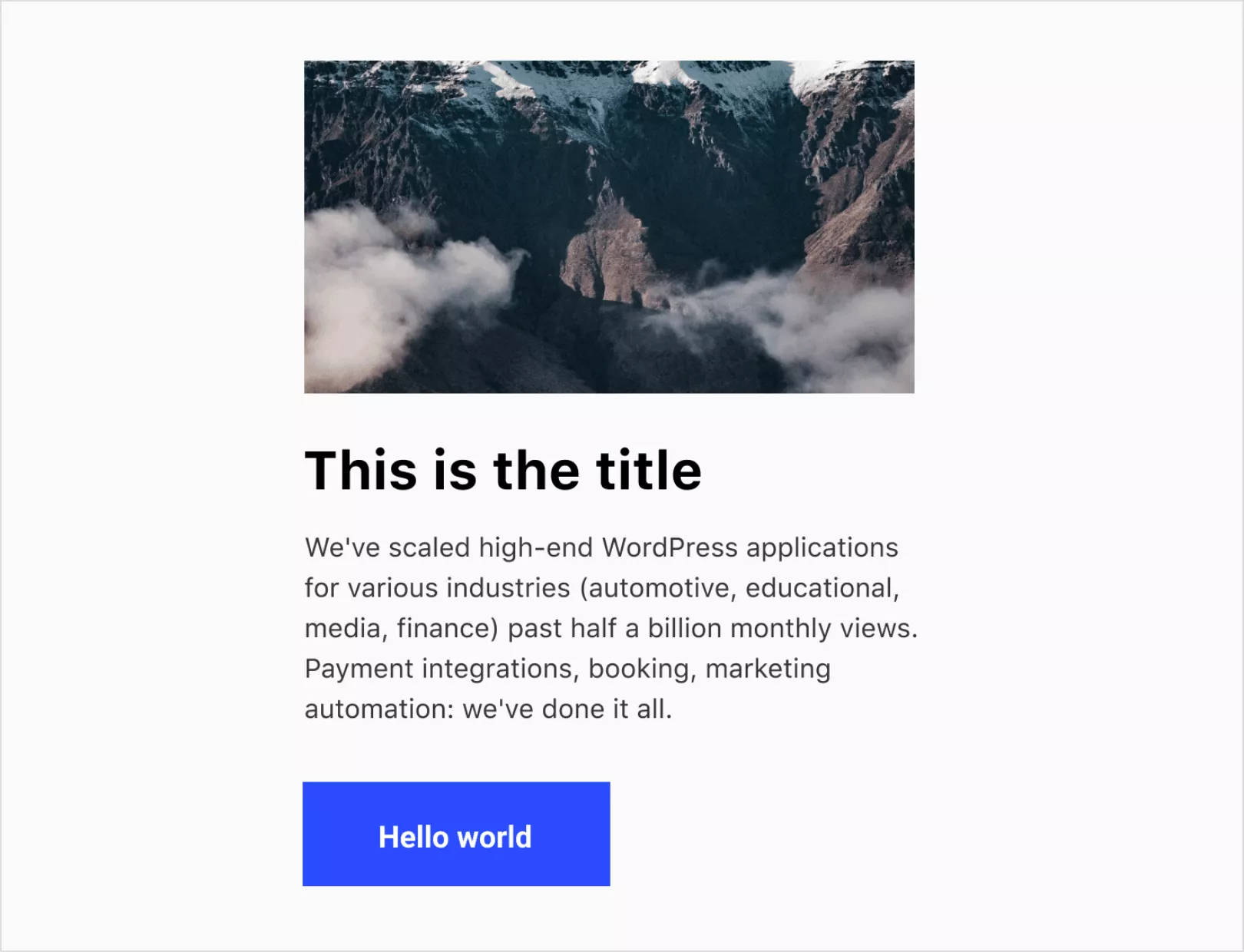
See the corners. All 90 degree perfect angles, no rounds. This means that our de Web design sign will mostly follow sharp corners. And it looks more consistent if the image also has those perfect angles. Just as if we had added inputs, they would all have these sharper corners too. Let’s add one more element:
We’ve added a grid of rectangles at the top right and bottom left corners. They could have been circles, but we have set them to squares to maintain sharpness. This same mindset should be maintained throughout the site. If you start to change elements, you may start to lose that sense of it, which in turn leads to inconsistent designs and weakening the brand.
Here’s the same design on top, but with rounded corners:
It’s the same, but now it seems completely different.
5 – Design with components
Components are found in all modern design tools like Figma and Adobe XD. They exist for a very good reason – developers implement sites in such a way that they can be reused as much as possible.
If you create an element like the one above, you just need to copy-paste it to another page and it will just work. There is no need to code it again with slight differences. As a designer, ideally you want to reuse your components in a similar way.
If you are making a homepage with 3 posts in a row, perhaps you can just reuse the same post from the homepage. It saves you time, saves developers time, and maintains design consistency for users.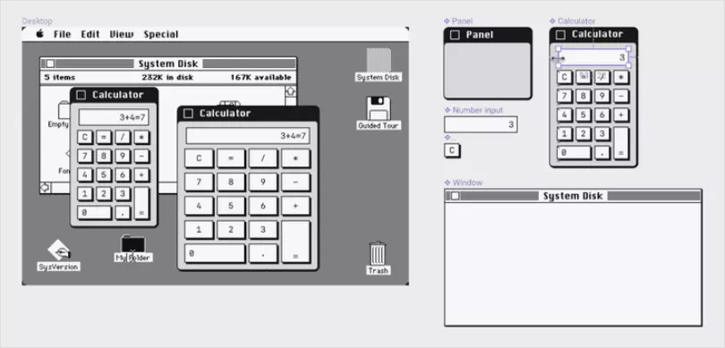
Imagine you are making a section heading. If you need to have 8 sections with a title, would you create it every time or copy the previous one? Ideally, you want to reuse it. But what if you need to change it from center-aligned to left-aligned? Maybe change the size a little, maybe the color? The advice from this is to try and DO NOT do it. Try to keep it as the original. If you really want different views (other than left-aligned / center / right-aligned), try doing just one. Not five or ten.
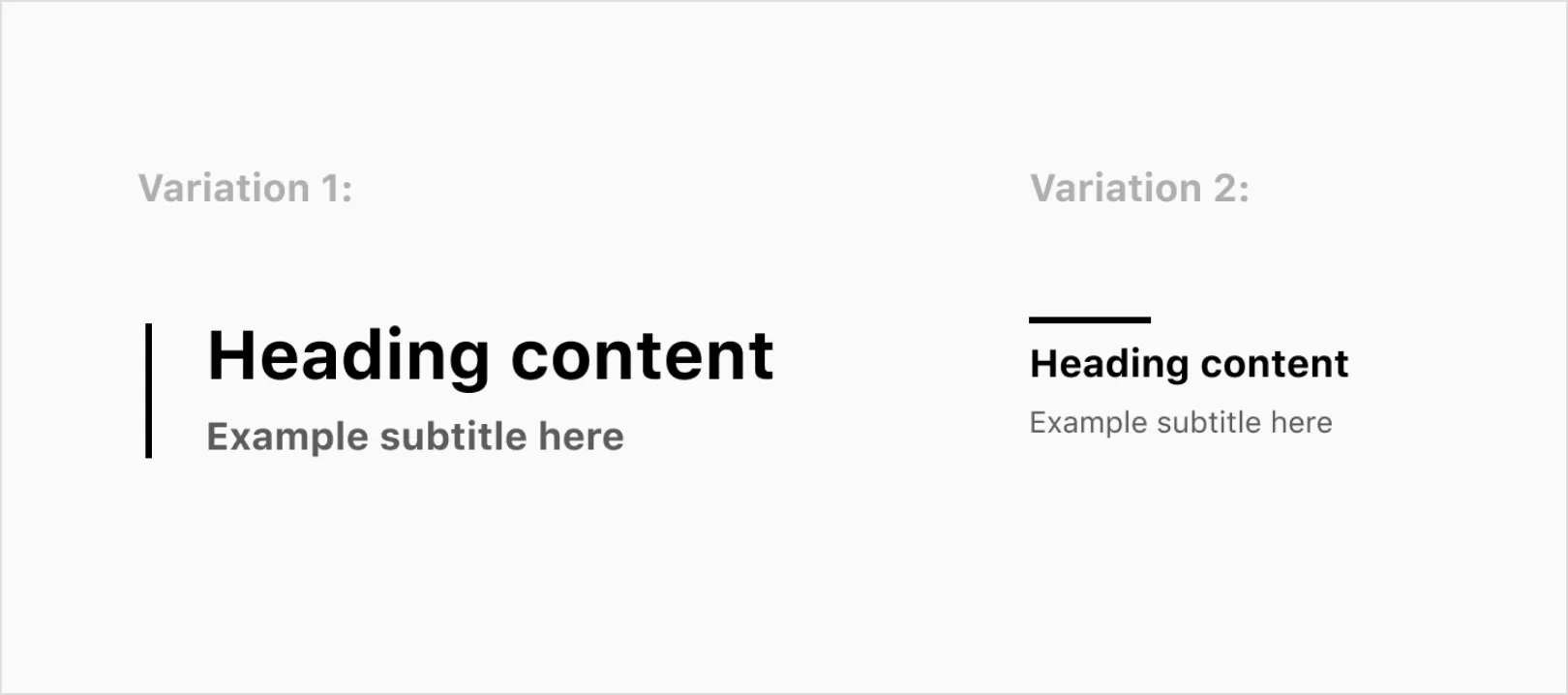
Eventually:
To achieve good results, you need to have a good understanding of design fundamentals such as color, contrast, white space, balance, visual hierarchy, order, and more.

